Flying Objects Instruction
Recreating the flying toasters from the After Dark screensaver that was very popular in the '90s will help you to learn a lot about CSS classes and more specific CSS animation as well as some Object Oriented Programming (OOP) concepts. However, it is important to note that CSS is NOT programming.
Gather Components
Most objects are composed of other objects. For example, most computers are composed of a desktop/laptop, a monitor and a keyboard in order for most people to use them.
As a result, before you can create most objects, you will need to gather the components that you will need to create a complete object.
- Create a folder and give it a name (e.g., CSS Animation) and then create another folder INSIDE of it and give it a name of images
- Copy and paste the images that you need into the images folder.
NOTE: Will will be using the two images that are provided to you; however, after completing this tutorial, you can substitute whatever images you want. Just make sure they are of the right types (e.g., images with transparent backgrounds) and the right size.
The ABCs of Programming (Theory)
As with all OOP programming languages, there are three things that you always do:
- Create an object
- Give it a name
- Tell it to do something
NOTE: Because we want to make the code generic, we will be using GENERIC names (e.g., object) instead of SPECIFIC names (Toaster) when referencing the headings and writing the code. This is helpful because it allows you to "switch" out the graphic with any other graphics that you want without much fuss.
Create An Object
The first thing you always do when using an OOP language is to create the object and position it where you want it to start.
- Create a new HTML framework file in your favorite HTML editor (e.g., Dreamweaver) or Notepad and save it. (e.g., css_animation.html):
<!doctype html>
<html>
  <head>
    <meta charset="utf-8">
    <title>Flying Objects</title>
  </head>
  <body>
  </body>
</html>
- Now, write the following highlighted lines in the <head> and <body> tags to add another object to the empty <div> object container.
<!doctype html>
<html>
  <head>
    <meta charset="utf-8">
    <title>Flying Toasters</title>
  <style>
  body{ background:black; }
  /*---------------------------ADD FIRST OBJECT -----------------------*/
  .display_object {
  position: absolute;
  background: url(images/toaster-sprite.gif);
  width:264px;
  height:64px;
  }
  </style>
  </head>
  <body>
    <div></div>
  </body>
</html>
CODE EXPLANATION:
- The position property is set to absolute to take the tag out of the normal document structure and "float" it above the page.
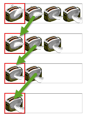
- The background property is used to set an image within the div tag. The image that we are using has a width of 264px and a height of 64px and contain four "sprites" or frames against a transparent background that will be used to create the animation later. Notice that the image is ONE picture but with FOUR images SIDE-BY-SIDE in it that will represents the four "frames" of the animation later.
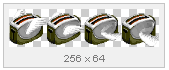
- However, notice that both the height and width properties of the div container MATCHES the height and width of the image so that you can currenly "see" all four frames.
Give Object A Name
Typically, you would give a <div> tag an ID name to, well, IDentify it; however, since we will eventually be created more than one object, we need to give it a class name so that we can target multiple objects with the same class name.
- Between the body tags, create an object using a div tag using the following highlighted line:
NOTE: Every tag should be treated as an object and given a name if you want to refer (talk) to it via CSS or other code (e.g., JavaScript).
<body>
    <div class="display_object"></div>
</body>
NOTE: It is helpful to give a class (e.g., display_object) a name that describes its intended purpose (e.g., to display an object).
- Change the width property from 264px to 64 px:
width:64px;
- CHECKPOINT: Save the file and preview it in a browser. You should now see only the first frame of the sprite even though the other frames are still there—they are just hidden from view. Also, note the the image is displayed in the upper top/left corner of the browser (e.g., 0,0). That's because that is its default position in the absence of any positioning properties. Since, the div was given a position property of absolute, you are able to click on it and move it anywhere you want on the page, which will be done in the next step.

- In Dreamweaver's Design View, hover over the image until the cursor turns to a double arrow icon and then click on it and drag it to the upper top/right corner of the screen. If you are using Notepad, enter the values in the next steps for the top and left properties.
- CHECK POINT: Save the file and preview it in a browser. You should see that the image is now on the right side of the screen. Also, note the if you used Dreamweaver to drag the image to the right side of the screen, it automatically create the top and left properties for you.
.display_object {
	position: absolute;
	background: url(images/toaster-sprite.gif);
	width: 64px;
	height: 64px;
  left: 631px;
	top: 30px;}
Tell Object To Do Something
Now that we have created an object and have given it a name and set its position, it's time to tell the object to do something. There are two part to creating an animation with CSS:
- Create an animation class that will tell the <div> tag HOW to animate.
- Set keyframes to the the <div> tag WHERE to animate.
- Write the following highlighted lines within the <style> tag:
<style>
/*---------------------------ADD FIRST OBJECT -----------------------*/
.display_object {
	position: absolute;
	background: url(images/toaster-sprite.gif);
	width: 64px;
	height: 64px;
	left: 631px;
	top: 30px;
}
/* Create an animation called "flap" using four steps (frames) over 0.4 seconds */
.animate_object1 {
  animation: flap 0.4s steps(4) infinite alternate;
}
@keyframes flap {
  from { background-position:  0px; }
  to { background-position: -256px; }
}
</style>
CODE EXPLANATION:
- The .animate_object1 class uses the animation property with the following values:
- flap—name of animation
- 0.4s—durantion of animation
- step(4)—number of steps for animation frames
- infinite alternate—repeat and alternate animation
- The @keyframe flap with the SAME name as the animation sets the from and to (start and stop) points for the background-position property of the image that is inside of the <div> tag. This causes each images inside of the single image to "slide" into view from the right starting point of zero to the left ending point fo -256:
- Now, APPLY the animation to the <div> tag.
<body>
    <div class="display_object animate_object1"></div>
</body>
- CHECK POINT: Save the file and preview it in a browser. You should see that the image now animates "in place" at the top right of the screen.
- Write the following highlighted lines to animate the already animated object:
<style>
/*---------------------------ADD FIRST OBJECT -----------------------*/
.display_object {
	position: absolute;
	background: url(images/toaster-sprite.gif);
	width: 64px;
	height: 64px;
	left: 631px;
	top: 30px;
}
/* Create an animation called "flap" using four steps (frames) over 0.4 seconds */
.animate_object1 {
  animation: flap 0.4s steps(4) infinite alternate, fly 10s linear infinite;
}
@keyframes flap {
  from { background-position:  0px; }
  to { background-position: -256px; }
}
@keyframes fly {
  from { transform: translate(0, 0); }
  to { transform: translate(-1600px, 1600px); }
}
</style>
CODE EXPLANATION:
- Notice that you can add MULTIPLE animations to the same animation property if you separate them by commas.
- The fly animation has the following values:
- fly—name of animation
- 10s—durantion of animation
- linear—animation easing type
- infinite—repeat animation
- The @keyframe fly with the SAME name as the animation sets the from and to (start and stop) points for the transform property of the of the <div> tag. This cause the object to "fly" across the screen.
- CHECK POINT: Save the file and preview it in a browser. You should see that the object "flap" its wings AND "fly" across the screen from its initial position and after awhile it repeats the aimation over and over again. However, because the object has a FIXED position, it is not suitable for various screen sizes.To fix this problem, we will make the initial position relative to the screen size by using percentage values instead of pixel values and at the same time we will move it OFF the screen so that it is not shown we the page first load.
- Write the following highlighted lines in the style tag:
/* Position object off the screen 10% from the top and right so that it is responsive to various screen sizes. */
.position_object1 { right: 10%; top: -10%; }
/* Create an animation called "flap" using four steps (frames) over 0.4 seconds */
.animate_object1 {
  animation: flap 0.4s steps(4) infinite alternate, fly 10s linear infinite;
}
- Delete the fixed highligted lines from the display_object class:
.display_object {
position: absolute;
background: url(images/toaster-sprite.gif);
width: 64px; height: 64px;left: 631px;top: 30px;}
- Add the class to the div tag in the <body> tag to force the initial position of the object "off" the screen when the page loads.
<body>
    <div class="display_object object_position1 animate_object1"></div>
</body>
- CHECK POINT: Save the file and preview it in a browser. You should see that the object now animates ONTO the screen from the top corner. Scale the browser size to see that it will still animate from the top corner regardless of the screen size.
- Add additional objects within the body tag:
<body>
  <div class="display_object object_position1 animate_object1"></div>
  <div class="display_object object_position2 animate_object2"></div>
  <div class="display_object object_position3 animate_object3"></div>
  <div class="display_object object_position4 animate_object4"></div>
  <div class="display_object object_position5 animate_object5"></div>
</body>
- Add the following to the CSS style below the first .object_position1:
/* Position object off the screen 10% from the top and right so that it is responsive to various screen sizes. */
.object_position1 { right: 10%; top: -10%; }
.object_position2 { right: 20%; top: -15%; }
.object_position3 { right: 5%; top: -11%; }
.object_position4 { right: 15%; top: -12%; }
.object_position5 { right: 12%; top: -13%; }
- Add additional animations to the CSS style tag:
/* Create an animation called "flap" using four steps (frames) over 0.4 seconds */
.animate_object1 {
  animation: flap 0.4s steps(4) infinite alternate, fly 10s linear infinite; }
.animate_object2 {
  animation: flap 0.2s steps(4) infinite alternate, fly 8s linear infinite; }
.animate_object3 {
  animation: flap 0.2s steps(4) infinite alternate, fly 16s linear infinite; }
.animate_object4 {
  animation: flap 0.4s steps(4) infinite alternate, fly 11s linear infinite; }
.animate_object5 {
  animation: flap 0.2s steps(4) infinite alternate, fly 7s linear infinite; }
@keyframes fly {
  from { transform: translate(0, 0); }
  to { transform: translate(-1600px, 1600px); }
}
</style> - CHECK POINT: Save the file and preview it in a browser. You should see multiple objects fly onto the screen. Notice that the animation with 0.2 seconds flaps its wings faster AND that their speed value is smaller so they move faster to complete the "illusion" of the flying faster and thus moving faster.
(BONUS) Create Another Object
Now that you have a handle on how to create an animated object and then move it across the screen, let's create another object but this time simply move it across the screen.
- Write the following highlighted lines to the <body> tag:
<body>
<div class="display_object object_position1 animate_object1"></div>
<div class="display_object object_position2 animate_object2"></div>
<div class="display_object object_position3 animate_object3"></div>
<div class="display_object object_position4 animate_object4"></div>
<div class="display_object object_position5 animate_object5"></div>

<div class="display_object2 object2_position1 object2_animation1"></div>
<div class="display_object2 object2_position2 object2_animation2"></div>
<div class="display_object2 object2_position3 object2_animation3"></div>
<div class="display_object2 object2_position4 object2_animation4"></div>
<div class="display_object2 object2_position5 object2_animation5"></div>
</body>
- Write the following highlighted lines ABOVE the closing </style> tag:
/*______________________TOAST _______________________________*/
NOTE: Notice that one of the animation has a value of alternate-reverse. This will cause that object to go in the REVERSE direction from the others. It is important to note that the second object is using the same @keyframe fly as the first object because they both perform the same task.
.display_object2 {
position: absolute;
background: url(images/toast1.gif);
width: 64px;
height: 64px;
}
/* Position our toaster just off the screen at the upper right */
.object2_position1 { right: 10%; top: -10%; }
.object2_position2 { right: -2%; top: -10%; }
.object2_position3 { right: 10%; top: -12%; }
.object2_position4 { right: 20%; top: -18%; }
.object2_position5 { right: 30%; top: -13%; }
/* Animate toast */
.object2_animation1 {
animation: fly 10s 2s linear infinite alternate-reverse;
}
.object2_animation2 {
animation: fly 10s 4s linear infinite;
}
.object2_animation3 {
animation: fly 10s 6s linear infinite;
}
.object2_animation4 {
animation: fly 10s 1s linear infinite;
}
.object2_animation5 {
animation: fly 10s 3s linear infinite;
}
</style>
- (BONUS) To change the entire animation to use different objects, update the .display_object and .display_object2 classes and update the background properties for both.